Seven Floors of
Guinness Goodness
Some brands make a product. Others create a world you want to spend time in. What Guinness reminds me about originality, design and giving an identity room to surprise.
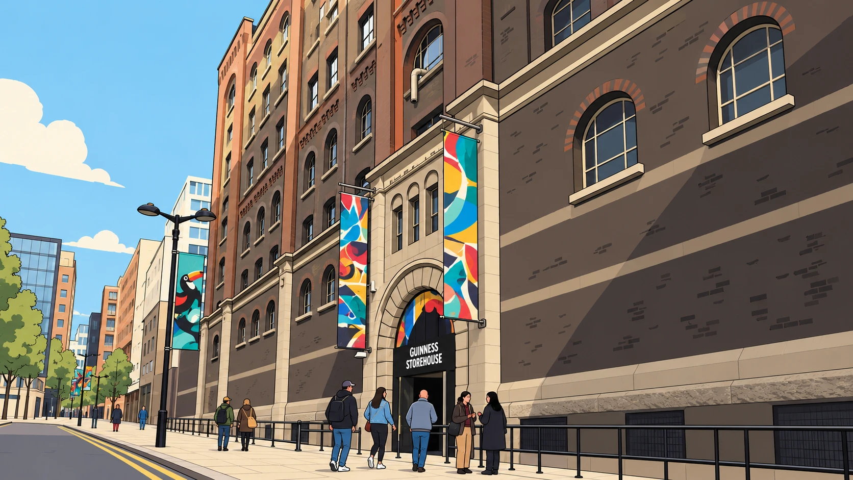
Guinness is one of those brands I keep coming back to for inspiration. And yes, I enjoy what’s in the glass. But my fascination goes beyond the drink.
As a designer, I’m drawn to its originality. The confidence of its visual identity. The imagination in its advertising. The way so many different expressions can still feel unmistakably part of the same brand.
There is something generous about that. Guinness gives you plenty to look at, think about and remember.
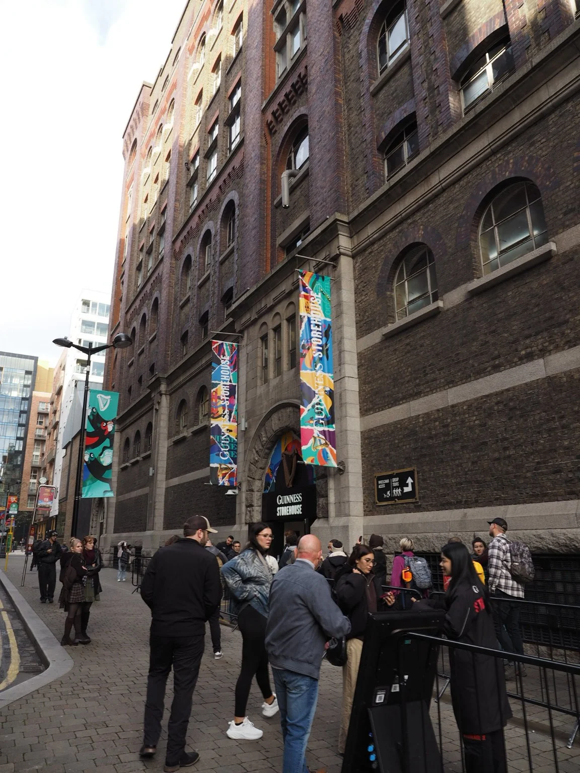
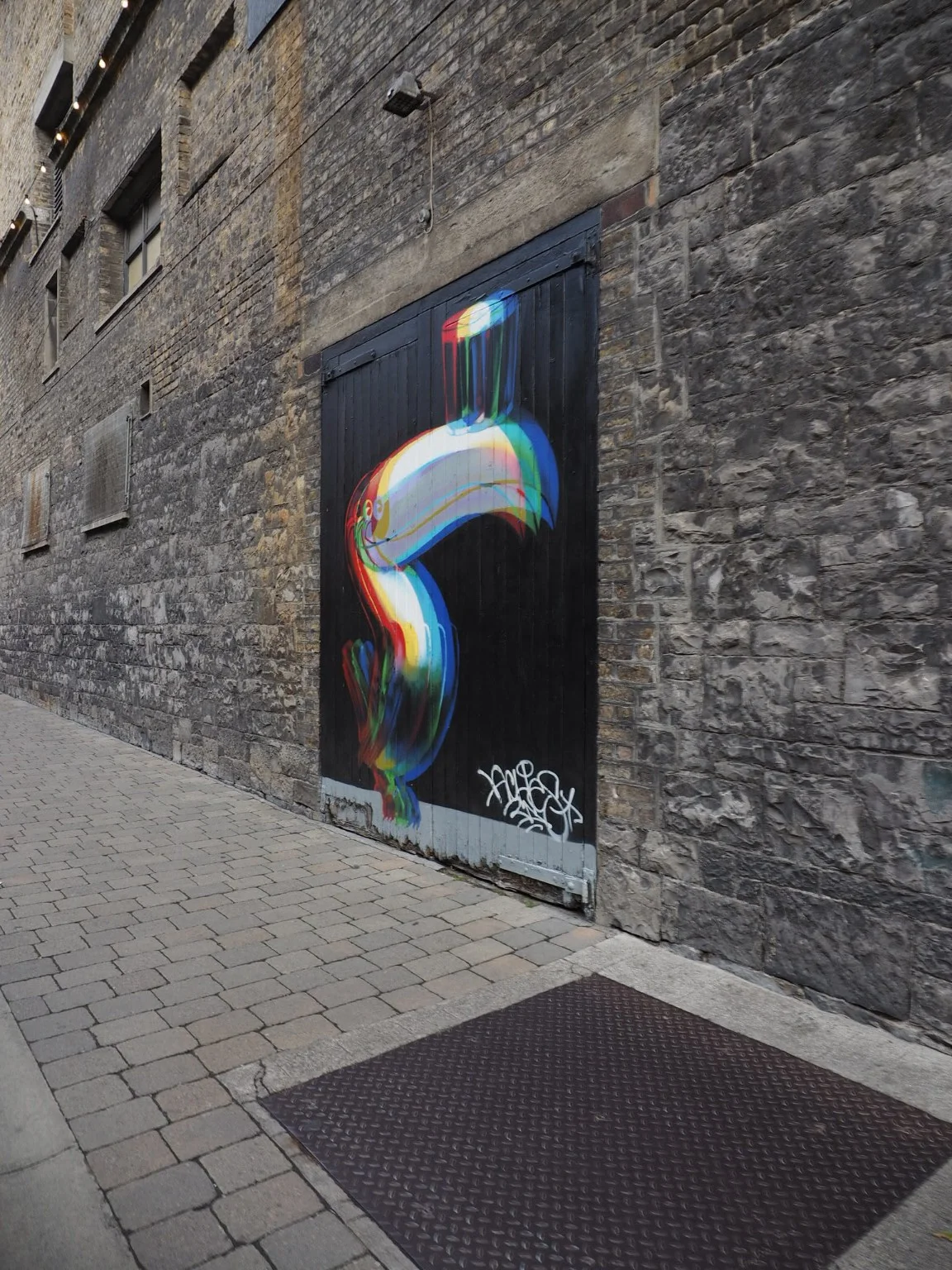
A brand you can walk through.
The Guinness Storehouse in Dublin takes that feeling and gives it seven floors. Seven floors of Guinness goodness.
The history, the ingredients, the brewing process: each becomes part of a carefully designed experience. You move through a story, with the spaces and displays helping you understand what goes into the product and why it matters.
What interests me is how the design gives that history a presence. Information has a rhythm. Materials and images contribute to the atmosphere. There is a sense of care that connects the smallest detail to the bigger story.
For me, this is where branding becomes especially interesting. An identity can begin on paper or a screen, then grow into something you can physically move through. You spend time inside it. You discover it at your own pace.
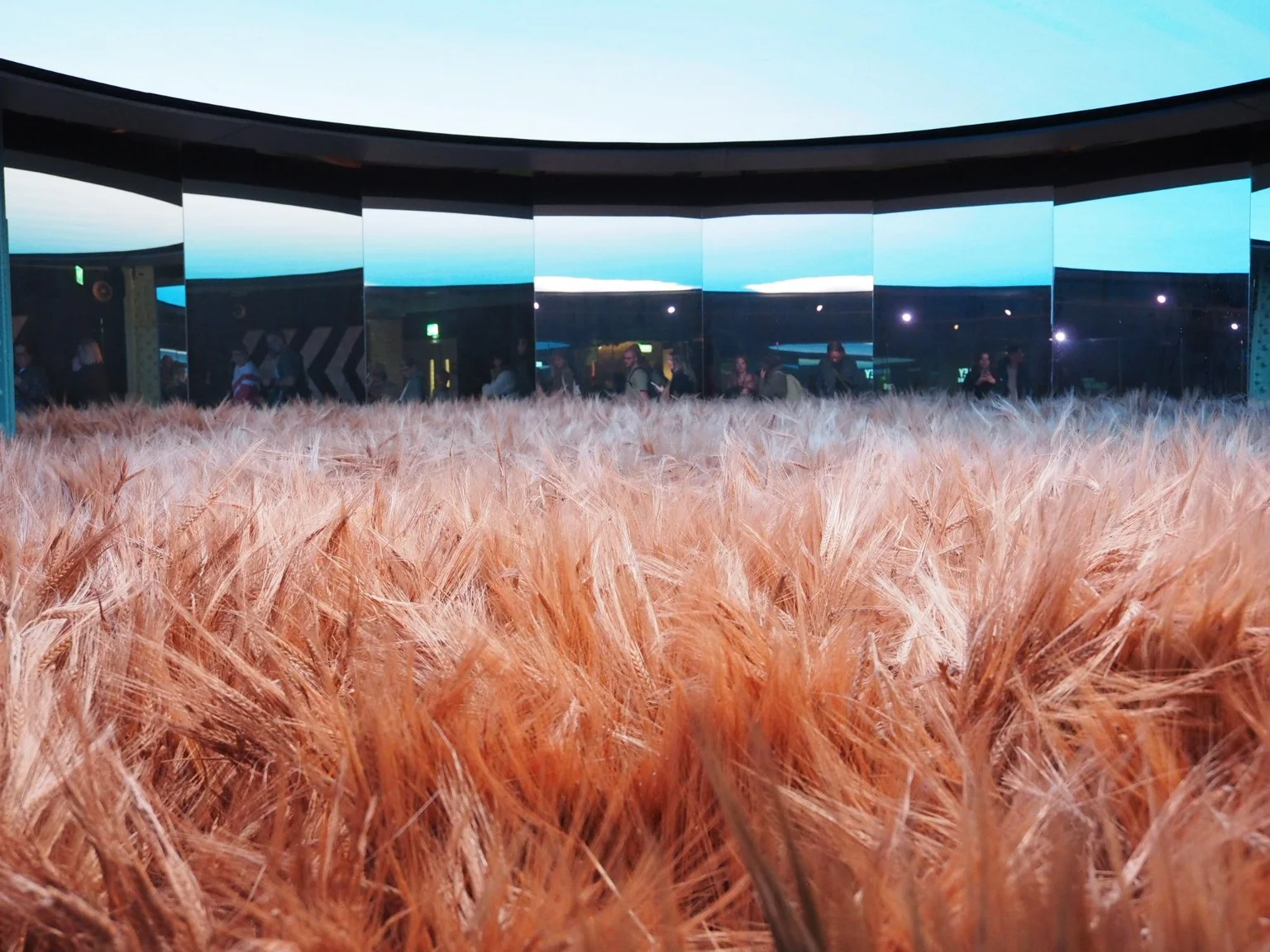
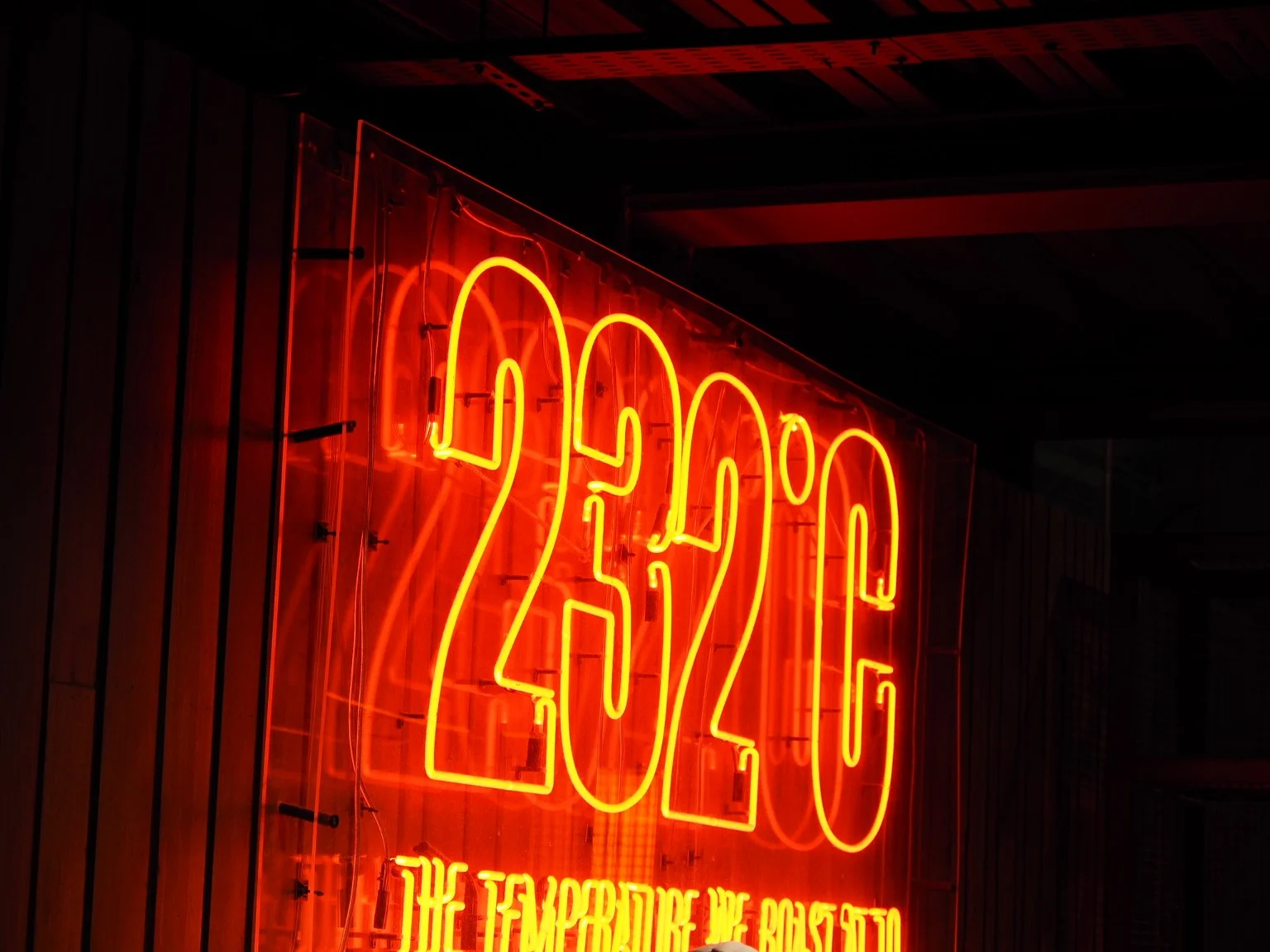
The care is in the details.
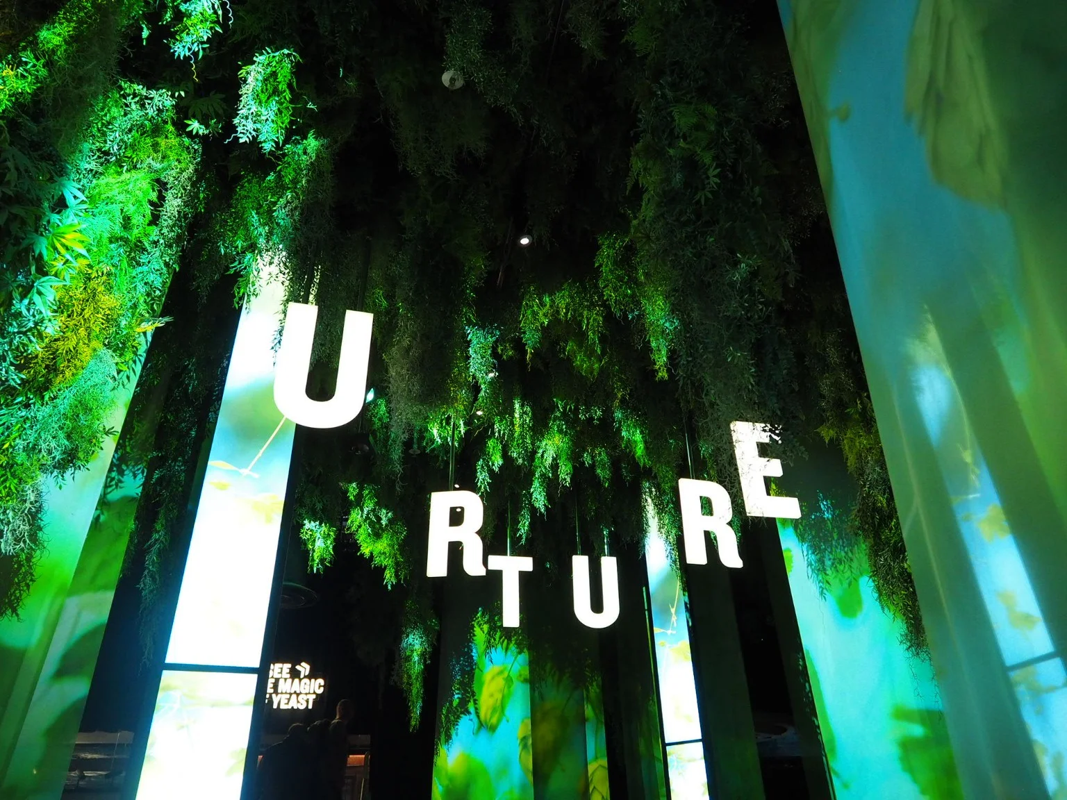
I find myself looking at the way the story is presented as much as the story itself. A field of barley becomes an image you can almost step into. A temperature becomes a glowing piece of typography. Even a practical part of the brewing process can have a visual presence of its own.
That is a useful reminder for my own work. Good information design starts with deciding what deserves attention. Then it needs a form that makes you want to look. Scale, contrast and pacing all help turn a collection of facts into something you can follow.
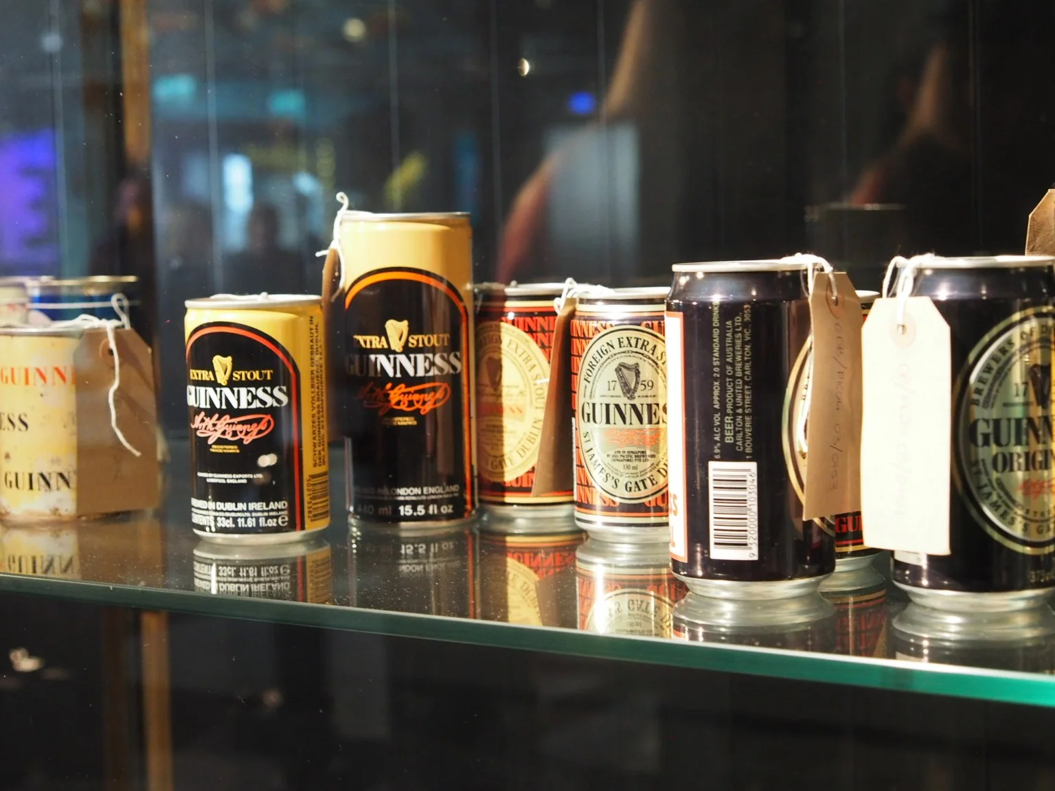
The packaging displays offer another way into that thought. Put the different expressions together and you begin to see the strength of the underlying identity. There is room for variation because there is something recognisable holding it together.
The horses in the waves.
Then there is the advertising. The surfers. The sea. Those extraordinary horses emerging from the breaking waves.
Surfer, directed by Jonathan Glazer, is one of those commercials whose images stay with me. The black and white, the movement, the tension: everything contributes to a feeling that is difficult to reduce to a single sentence.
There is confidence in giving an idea that much space. Confidence in an image. In atmosphere. In the audience’s ability to feel a connection before someone explains it.
As someone who works with design and moving images, I find that deeply inspiring. A strong visual idea can carry so much. Its meaning grows through the way it is made: the timing, the composition, the relationship between sound and movement.
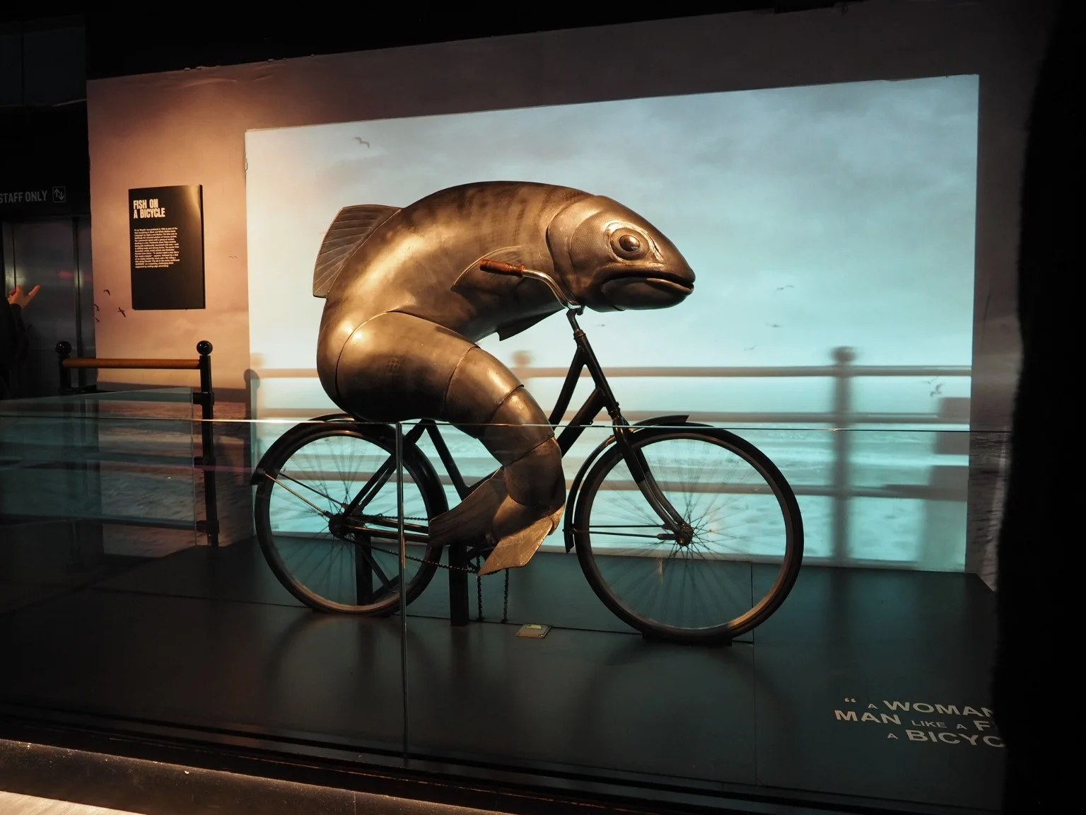
A fish on a bicycle.
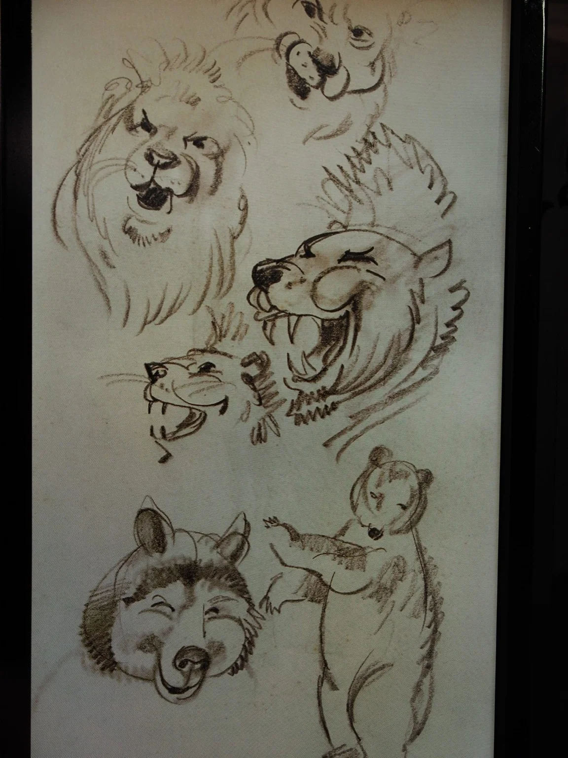
I especially like Ogilvy & Mather’s Not Everything in Black and White Makes Sense campaign. Bicycle, the 1996 commercial recalled by this display, plays with a familiar saying about a woman needing a man as much as a fish needs a bicycle, then gives us the wonderfully absurd image of a fish actually riding one. That is the kind of advertising idea I enjoy: a familiar thought becomes something you have to look at again. The black-and-white treatment connects the idea to Guinness, while the visual surprise gives it a life of its own. As a designer, I admire how much character comes from that simple relationship between words and image. It makes me smile, and it stays with me.
Room for a different kind of energy.
The Guinness commercials with Jason Momoa give me another reason to enjoy the brand’s creative range. His warmth and larger-than-life presence bring a very different energy to the screen.
I like that a brand with such a distinctive visual history can make room for that personality. The playfulness belongs alongside the more dramatic work. Both make me want to watch.
Looking through the advertising history at the Storehouse, that variety becomes part of the pleasure. An eccentric animal character, a striking cinematic image, a moment of humour: each gives the brand another way to connect. There is a willingness to entertain that I appreciate.
A strong identity gives an idea somewhere to belong — and room to go somewhere unexpected.
Sander Oord / A design note
Recognisable, with room to surprise.
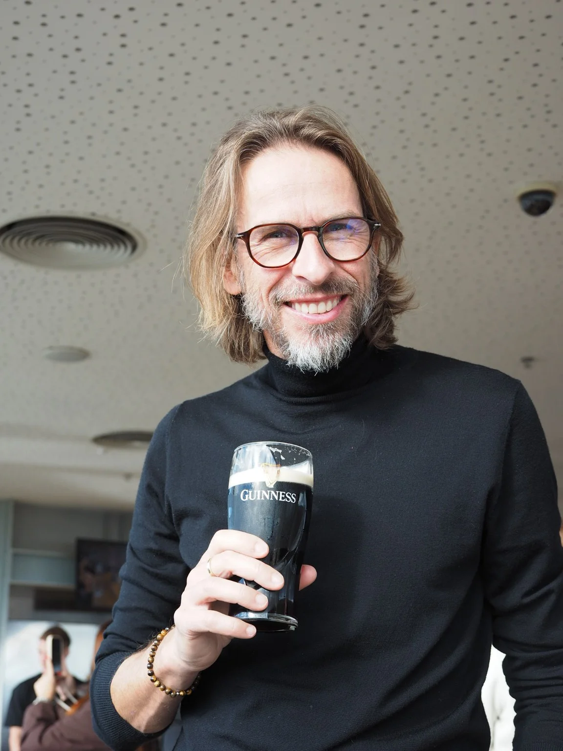
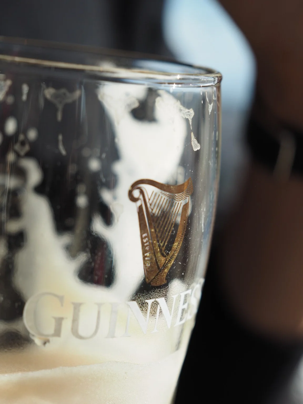
Guinness has such a recognisable foundation. The dark beer and pale head. The harp. The lettering. A striking economy of colour. That foundation gives its creative work room to travel.
This is something I think about in my own practice. How do you create an identity with enough character to hold together, and enough freedom to keep discovering new things?
Consistency takes judgment. Sometimes a familiar element needs to stay exactly where it is. Sometimes the most interesting thing you can do is let it lead somewhere unexpected. Guinness reminds me how rewarding that balance can be.
Something to take back to the studio.
What I take from Guinness is a renewed appetite for making work with character. Work that rewards attention. Work with a clear idea behind it, carried through with care. Work that allows a little strangeness, humour or imagination to become part of what people remember.
That is why Guinness belongs among my power brands. I enjoy the product. I admire the world around it. And as a designer, I leave with plenty to think about.