This is what
an AI-powered
website looks like.
An idea in the supermarket queue. A new story on the website. How building RETURN with AI is changing my idea of what a personal website can be.
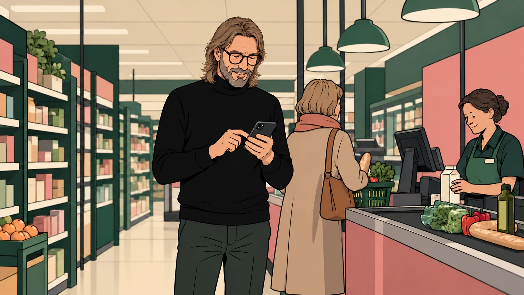
Imagine me in a supermarket queue. A basket, a few people ahead, a moment with nothing urgent to do. An idea for a Journal entry comes to mind. I take out my phone, describe the thought and ask for it to become an article on my website. Perhaps it needs an illustration too. A man in a black turtleneck, standing in a supermarket queue, for example.
That is a perfectly reasonable way for me to start making something now. The idea does not have to survive until I am back at my desk. I can give it direction while it is still fresh, then review and refine what comes back. The gap between noticing something and doing something with it has become much smaller.
Built through conversation.
RETURN has been built entirely through working with AI: the implementation, the evolving layouts, the illustrations and even the variable typeface. I bring the concept, the visual direction, the observations and the decisions. AI helps turn those into things I can open, use, question and change.
That distinction matters to me as a designer. There was no single prompt that produced a finished identity. There have been many conversations about rhythm, hierarchy, cropping, colour and behaviour. An illustration needed fewer details. A heading needed to feel like the rest of the site. A mobile layout needed more room. The work takes shape through those decisions.
What makes this website personal is that those decisions accumulate. The font, the images, the writing and the experiments begin to speak the same language. AI gives me a much larger workshop in which to develop that language.
The website is part of the practice.
A personal website can easily become a place where you put work after everything interesting has happened elsewhere. With RETURN, I want the making to remain visible. Journal is where I think out loud about design, AI, books, music and things I notice. Lab is where an idea becomes something you can actually try.
The relationship works in both directions. An experiment can lead to an article about what I learned. An article can raise a question worth turning into an experiment. The Return Display font has its own place in Lab, where you can explore what happens between its digital and more physical forms. The site itself becomes part of the evidence.
Behind the public pages is a private working environment: Journal editing, galleries, statistics and the marketing module. My photographs have their own route into the site through Lightroom, while client access, favourites and downloads support the work around them. These are useful everyday capabilities, connected to the same place where I present my thinking.
One thought can travel further.
The private marketing module is called RETURN Signal. It starts with the two public pillars, Journal and Lab, and leaves room for short social-only notes. I can choose an existing story or experiment, add a brief and ask AI for three different social post drafts: a personal observation, a practical insight and an invitation to a conversation.
That makes a useful difference. A piece written for the Journal does not need to be squeezed unchanged into every channel. Its central idea can be approached differently for LinkedIn or Instagram, with a suggested visual and points I should check. The original article and illustration remain close at hand.
I can edit the copy, choose an image, set a date and keep track of what is ready. The planning includes a calendar export; posting to the social platform is currently a manual step. The system helps me prepare and organise the work. It gives me a better starting point while leaving the final editorial choice with me.
The gap between having an idea and making it real is becoming smaller. What I choose to make still matters.
Sander Oord / Building RETURN
Extraordinary powers, ordinary moments.
This is where the phrase extraordinary powers starts to make sense to me. I can move between art direction, writing, illustration and building without arranging a separate production process for every small idea. I can ask for a functioning addition to the website, then judge it as something real.
The supermarket queue is a good image for that shift. It is an ordinary moment with an unexpectedly useful possibility inside it. A voice message or a few sentences can become the beginning of a brief. Later, that brief can become a page with the right typography, an illustration and a place in the Journal. I still need to recognise what is worth saying.
I find that more interesting than the amount of content I could generate. It gives the small, easily lost observations a chance: something in a book, a line of light between plants, a design decision that stays with me. The website becomes easier to keep close to the way I actually live and think.
The designer moves into the system.
Building this way has made me more attentive to the rules behind the output. If every new page needs to be explained from scratch, the process is fragile. A shared layout, an established illustration style and clear content structures give each new addition something dependable to belong to.
I am designing those conditions as well as the pages. What should the system remember? Which parts can follow a repeatable pattern? Where do I want a fresh interpretation? Where do I need to look closely before something goes live? Those questions feel increasingly central to the work of design.
The corrections are part of it too. Recently, the galleries were spending too much effort reading photo metadata while someone was trying to browse. The useful design decision was to simplify: use the information already stored and show photographs in a straightforward grid. Having more capabilities only helps when the experience stays clear and quick.
A small step towards a different web.
I can imagine this developing further: a website that helps prepare a complete campaign from a new article, connects related experiments and brings forgotten ideas back at the right moment. Those are directions to explore. The current system is still a developing practice, with checks, revisions and some manual handovers.
I would not call RETURN the finished website of the future. It is one personal, working example of a direction I find compelling: a website whose identity, content and tools can evolve together, with conversation as one way of shaping them.
For me, the next chapter of web design includes that whole relationship. The visible page matters. So does the system that helps a person keep it useful, coherent and alive. RETURN lets me investigate both, with my hands in the work.
And sometimes, the next addition begins while I am waiting to pay for the groceries.
Try the Lab experiments ↗